20120407/Raskin vs Engelbart
I am no academic, this is just a hobbyist characterization that may only be roughly useful.
I met Jef Raskin briefly around 2000, he was giving out copies of his book The Humane Interface. Raskin (who died in 2005) was one of the creators of the original Apple Macintosh, and a proponent of an appliance idea of computing. For every application, the computer interface changes to become the simplest, most straightforward representation of a particular use. So, if an app is for controlling a toaster, we pretend the computer is not a computer, but rather it's a toaster, and model those well-understood controls on the screen. To pop the toast, "click" on the on-screen lever. For every new application, an entirely use-appropriate usage model may be used. The advantage is, if you're familiar with the appliance, it's very easy to use.
Douglas Engelbart is a profound contributor to technology, envisioning and creating early models of many of the most important features of modern computing decades before they became mainstream. In my interpretation of his approach, particularly after reading the excellent book What the Dormouse Said, is that we should treat the computer as a computing device, that offers re-usable facilities across all applications. In an exaggerated Engelbart toaster application, there'd be a menu option for "Operations" (common to all similar in all applications) with an option to "Pop toast." The disadvantage is, you have to learn the common facilities.
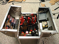
If there were camps (no doubt these ideas are complementary, particularly when their developed features become common), I'd be soundly in the Engelbart camp. If I'm spending so much time with it, I want my computer to be a computer, I want to learn how to consistently work with content, I want an expanding, consistent toolset that eventually offers me meta capabilities.
A good example of Raskin's approach is the iPhone. It's designed to be as simple as possible, with just one button (aside from volume). Android, on the other hand, has (with some current changes), four buttons. A home button (like the iPhone), a menu button, which consistently accesses the app's functions, a back button, used for navigation in or between apps, and a search button. Granted, these buttons don't apply for every type of app, but they make apps more obvious for me, and iPhone has had to come up with some really, really inobvious workarounds (like having to double-click the button, hah hah).
This is also reflected in current operating environment design. For a while, we had a kind of plateau in WIMP interfaces. Windows, Mac, Unix/Linux graphical interfaces all pretty much worked the same way, with the mouse, menus, toolbars, copy and paste all ready functions, very much, in my mind, in the Engelbart model. Now, operating systems are struggling to merge or subsume their operation with "the touchscreen way." The result, currently, to my mind, is mess. Word, Firefox and Chrome pretty much have entirely reinvented their interfaces several times, each time it's a new puzzle game to figure out where things are. Fine for savvy people with an interest in constantly figuring things out, but leaving many other people out.
Another example is Wikipedia (and Mediawiki sites generally) vs. the typical Web 2.0 website. Wikipedia has a standard menu set that makes many people groan, because they never use "recent changes," (neat to see what's going on) "history" (pretty essential to understand the progression and current state of a page), or "talk," where you can see the formulations, controversies, and subjective content about a topic, as well as the personalities behind their development.
The contrasting Web 2.0 (not a perfect category) website is as simple as possible. It has a logo in a large font, a search in the middle of the screen, maybe a few items of category below that, all in primary colours. The user is there for one thing, though there's probably a programming interface.
I don't really like divided worlds, and there tends to be a large chasm between these approaches. We spend so much time with computers, I think it's reasonable for most people to learn a few common operations. Sure, a child can learn to use some iPhone operations intuitively, but once you get past that subset, they have to get into learning things, and a lot of things get left behind when oversimplified (as an example, the iPhone had a lot of catching up to do when Apple realized people wanted to run more than one app at once). Although interface will continue to evolve, sometimes it feels like there's change for the sake of change, or simply half baked ideas. Is the mindset of "digital literacy," which increasingly affects individuals ability to interact with the world, expressed best by an iPhone, or a reusable toolset built on the facts of computing? I think the latter.

